
Professional photo editing apps with advanced color correction tools are revolutionizing how we approach image enhancement. No longer are we limited by basic filters; today’s apps offer a sophisticated suite of tools allowing for precise control over color, tone, and mood. From subtle adjustments to dramatic transformations, these applications empower both amateurs and professionals to achieve stunning results.
This exploration delves into the best apps, their features, and how to master advanced color correction techniques to elevate your photography.
We’ll examine leading apps, comparing their interfaces, pricing, and the specific capabilities of their color correction tools. We’ll cover techniques like curves, levels, and selective color adjustments, providing practical examples and step-by-step tutorials. Understanding these tools is key to achieving professional-looking edits, whether you’re retouching portraits, landscapes, or product shots. The goal is to equip you with the knowledge and skills to confidently manipulate color and create images that truly capture your vision.
Top Professional Photo Editing Apps
Choosing the right photo editing app can significantly impact your workflow and the quality of your final images. The market offers a range of options, each with its own strengths and weaknesses. This section will delve into some of the leading professional photo editing apps, comparing their features, pricing, and user experience.
Professional Photo Editing App Comparison
This table compares five leading professional photo editing apps across various criteria. Note that pricing can change, and specific features may vary based on subscription level.
| App Name | Pricing Model | Platform Compatibility | Key Features |
|---|---|---|---|
| Adobe Photoshop | Subscription (various plans) | Windows, macOS, iPadOS | Extensive layer support, advanced masking tools, powerful color correction, RAW editing, extensive plugin ecosystem. |
| Adobe Lightroom | Subscription (various plans, often bundled with Photoshop) | Windows, macOS, iOS, Android, Web | Non-destructive editing, powerful organization tools, cloud syncing, excellent color grading, RAW processing, mobile-desktop workflow. |
| Affinity Photo | One-time purchase | Windows, macOS, iPadOS | Similar feature set to Photoshop, strong performance, excellent value for money, focus on speed and efficiency. |
| Luminar Neo | Subscription or perpetual license | Windows, macOS | AI-powered features, intuitive interface, focus on ease of use, strong portrait editing tools, masking and layers. |
| Capture One | Subscription or perpetual license | Windows, macOS | Powerful RAW processing, tethered shooting support, excellent color science, advanced masking and adjustment tools, strong cataloging system. |
User Interface and Workflow Analysis
Each app presents a different user experience. Adobe Photoshop, while incredibly powerful, boasts a complex interface that can be challenging for beginners. Its workflow involves many panels and menus, demanding a steeper learning curve. Adobe Lightroom, in contrast, emphasizes a more intuitive, streamlined workflow, prioritizing ease of use and efficient organization. Affinity Photo aims for a balance, offering a powerful feature set within a relatively user-friendly interface.
Luminar Neo prioritizes ease of use with its AI-powered features and simplified workflow, while Capture One provides a robust professional workflow that may require more learning but offers unmatched control.
Professional photo editing apps offering advanced color correction tools are invaluable for anyone needing precise image control. Managing your finances effectively is just as crucial, and thankfully there are great resources available, like checking out these helpful Finance Apps to stay organized. Returning to photo editing, remember that mastering color correction can significantly elevate the quality of your images, boosting your professional portfolio.
App Pros and Cons
Understanding the advantages and disadvantages of each app is crucial for informed decision-making. User reviews and expert opinions consistently highlight specific strengths and weaknesses.
Adobe Photoshop:
Professional photo editing apps offering advanced color correction are invaluable for creating stunning visuals. But imagine taking that control a step further by experiencing your edits in a fully immersive environment using Virtual Reality Apps. This allows for a unique perspective on color accuracy and overall image impact, further refining your skills with professional photo editing apps.
- Pros: Industry standard, unparalleled feature set, extensive plugin support.
- Cons: Steep learning curve, expensive subscription, resource-intensive.
Adobe Lightroom:
- Pros: Intuitive interface, excellent organization tools, cloud syncing, great for mobile workflow.
- Cons: Fewer advanced features than Photoshop, subscription model.
Affinity Photo:
- Pros: Powerful features at a one-time purchase price, fast performance.
- Cons: Smaller community compared to Adobe products, fewer plugins.
Luminar Neo:
- Pros: AI-powered features simplify editing, user-friendly interface.
- Cons: Fewer advanced manual controls compared to others, subscription or perpetual license.
Capture One:
- Pros: Excellent RAW processing, powerful color science, strong tethered shooting capabilities.
- Cons: Steeper learning curve than some alternatives, subscription or perpetual license.
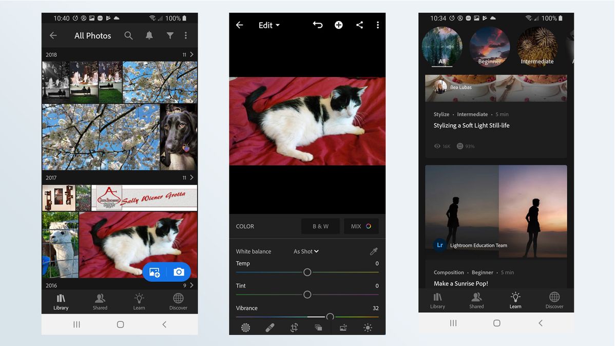
Advanced Color Correction Tools
Professional photo editing often requires fine-tuned control over color, going beyond simple adjustments. Advanced color correction tools provide this precision, allowing for nuanced edits that transform ordinary images into stunning visuals. These tools are essential for achieving a consistent look across a series of images, correcting color casts caused by lighting conditions, or simply enhancing the mood and impact of a photograph.
Curves Adjustments
Curves adjustments offer the most powerful and versatile way to manipulate the tonal range of an image. They work by allowing you to adjust the brightness of specific tonal ranges independently. Instead of simply adjusting overall brightness and contrast, curves lets you target shadows, midtones, and highlights individually. For example, you could selectively brighten the shadows without affecting the highlights, or vice-versa.
Imagine a landscape photo where the sky is overexposed. Using the curves tool, you could lower the brightness of the highlights in the sky without affecting the detail in the rest of the image. A before-and-after comparison would show a dramatic reduction in the blown-out sky, restoring detail and a more natural look. Conversely, a dark image could be brightened by lifting the shadow curve.
The before image would appear dark and lacking detail, while the after image would reveal more texture and vibrancy in the shadows.
Levels Adjustments
Levels adjustments provide a simpler, histogram-based approach to tonal adjustments. The histogram visually represents the distribution of tones in your image. By adjusting the input levels (black point, midtones, white point), you can effectively change the dynamic range of your image. For example, a photo that appears slightly dull could have its contrast significantly increased by expanding the range between the black and white points.
Professional photo editing apps offering advanced color correction tools are a must-have for anyone serious about image quality. Finding the right app can sometimes feel like navigating a huge online marketplace, which is why checking out resources like Shopping Apps to compare different options can be helpful. Once you’ve found the perfect app, you’ll be amazed at the level of control you have over your images’ colors and overall look.
A before-and-after would show a dull image transforming into a vibrant one with improved contrast and detail. Conversely, an image with harsh contrast could be softened by compressing this range. The before image would appear harsh and possibly clipped in highlights or shadows. The after image would show a more balanced and natural contrast.
Selective Color Adjustment
Selective color adjustments allow precise color manipulation within specific color ranges. This is particularly useful for fine-tuning individual colors without affecting others. For instance, you might want to reduce the saturation of the reds in a portrait to make the skin tones appear more natural, or boost the saturation of the greens in a landscape to make the foliage pop.
A before-and-after comparison of a portrait might show overly saturated red tones in the cheeks before adjustment, and a more natural, subtle redness after adjustment. Similarly, a landscape photo might have dull greens before the adjustment, but vibrant, lush greens after.
Step-by-Step Tutorial: Enhancing a Portrait
Let’s enhance a portrait using Curves, Levels, and Selective Color. Assume our starting image is a slightly underexposed portrait with dull skin tones and slightly washed-out colors.
1. Levels Adjustment
First, we’ll use the Levels tool to brighten the overall image and increase contrast. By adjusting the input levels, we’ll expand the tonal range, making the image brighter and more vibrant. The histogram will be used as a visual guide to determine the optimal adjustments. The before image will appear dark and lacking detail; the after image will be brighter with more visible texture and contrast.
2. Curves Adjustment
Next, we’ll use the Curves tool to subtly enhance the midtones. We’ll create a gentle S-curve to add contrast and depth without clipping highlights or shadows. This will add more dimensionality to the image. The before image will appear relatively flat; the after image will show improved depth and a more three-dimensional look.
3. Selective Color Adjustment
Finally, we’ll use the Selective Color tool to warm up the skin tones. We’ll reduce the amount of Cyan and add a touch of Yellow to the yellows in the image, resulting in a warmer and more natural skin tone. The before image will have cooler, less natural skin tones; the after image will have warmer, more natural-looking skin tones.
Specific App Feature Comparisons
Let’s delve into a detailed comparison of the color correction capabilities of three leading professional photo editing applications: Adobe Lightroom, Capture One, and Luminar Neo. While all three offer extensive color correction tools, their approaches and the precision they afford differ significantly. We’ll examine their strengths and weaknesses, highlighting how these differences manifest in the final edited images.
Color Correction Toolsets: A Comparative Overview
Each application boasts a robust suite of color correction tools, but their organization and functionality vary. Lightroom relies heavily on its intuitive sliders for adjustments like exposure, contrast, highlights, shadows, whites, and blacks. Capture One provides a similar slider-based approach but adds more granular control over individual color channels (red, green, blue) and offers powerful tools for color balancing using specific color pickers.
Luminar Neo, known for its AI-powered features, incorporates both traditional slider adjustments and AI-based tools like “AI Sky Enhancer” and “AI Skin Enhancer” that indirectly affect color balance through targeted adjustments. This creates a blend of precise manual control and automated enhancements.
Precision and Control: A Deeper Dive
Lightroom’s strength lies in its ease of use and the intuitive nature of its slider-based adjustments. For quick color corrections, it’s highly efficient. However, for extremely fine-tuned adjustments, the lack of direct per-channel control can be limiting compared to Capture One. Capture One’s extensive channel controls allow for highly precise color adjustments, making it ideal for complex color grading and correcting specific color casts.
Luminar Neo, while offering impressive AI-powered features, might lack the same level of granular control as Capture One, especially for users who prefer a purely manual approach. Its AI features can sometimes introduce unexpected shifts in color, requiring further manual refinement.
Strengths and Weaknesses of Each App’s Color Correction
- Adobe Lightroom: Strengths include ease of use, intuitive interface, and a wide range of basic adjustments. Weaknesses include a relative lack of granular control compared to Capture One for very precise color correction.
- Capture One: Strengths include unparalleled precision in color channel adjustments and powerful color balancing tools. Weaknesses include a steeper learning curve and a more complex interface compared to Lightroom.
- Luminar Neo: Strengths include AI-powered tools that automate certain aspects of color correction and enhance specific image elements. Weaknesses include potential for unintended color shifts from AI tools, requiring manual correction, and potentially less granular control compared to Capture One for highly specific edits.
Examples of Edited Images: Illustrating Variations
Imagine a landscape photograph with an overly warm sunset. In Lightroom, one might subtly lower the temperature slider and adjust the highlights to refine the colors. The result would be a pleasing, balanced image, but perhaps lacking the nuanced control possible with other software. Using Capture One, a user could independently adjust the red and yellow channels, subtly reducing their intensity in specific areas to achieve a more accurate and sophisticated color correction.
The image might exhibit a more natural and less processed look. Luminar Neo, with its AI Sky Enhancer, could automatically adjust the sunset colors, potentially creating a more vibrant but potentially less natural-looking result. The AI tool might enhance saturation in a way that doesn’t perfectly align with the overall color harmony of the image, requiring further manual adjustments to achieve a fully refined result.
The differences, though subtle, highlight the different philosophies and levels of control offered by each application.
Workflow and Best Practices for Color Correction
Source: futurecdn.net
Mastering color correction is crucial for professional-looking photos. A consistent workflow ensures efficiency and high-quality results, allowing you to focus on creative aspects rather than tedious adjustments. This guide Artikels a typical workflow and best practices for achieving accurate and impactful color correction using advanced photo editing tools.Color correction is an iterative process, refining the image gradually to achieve a natural and balanced look.
It involves adjusting elements like white balance, exposure, contrast, and color saturation to match a desired aesthetic or correct inaccuracies from the original capture. The workflow should adapt to the specific image and desired outcome. It’s less about following rigid rules and more about understanding the tools and applying them effectively.
Professional photo editing apps with advanced color correction tools are essential for anyone wanting to make their images pop. These tools are especially useful when editing travel photos, and you’ll find plenty of inspiration for your next trip by checking out some great options on this list of Travel Apps. After all, who wants dull, washed-out memories of their amazing adventures?
So, grab those editing apps and start perfecting those travel shots!
Establishing a Baseline: Initial Adjustments
Before diving into specific color corrections, it’s vital to establish a solid foundation. This involves addressing global adjustments that affect the entire image. Begin by correcting the white balance, ensuring that neutral colors appear accurately as white, gray, and black. Then, adjust the overall exposure to achieve a balanced brightness. Fine-tune contrast to enhance the image’s dynamic range and ensure details are visible in both highlights and shadows.
Professional photo editing apps with advanced color correction tools are a must-have for anyone needing precise image control. Boosting your workflow efficiency often means utilizing the right apps, and that’s where checking out resources like Productivity Apps can really help. Finding the best tools for photo editing, in turn, improves your overall productivity and lets you focus on the creative aspects of your projects.
This foundational step prevents later adjustments from compounding errors. For example, if the white balance is significantly off, subsequent color grading will be ineffective and may even introduce further inaccuracies.
Targeted Color Correction with Masking and Layering
Masking and layering are powerful tools for precise color adjustments. Masking allows you to isolate specific areas of the image, applying edits only to those selected regions. Layering allows for non-destructive editing; adjustments can be made on individual layers without affecting the underlying image. For instance, imagine a portrait where the subject’s skin tone needs adjusting. Create a layer mask, select the skin area, and then apply a color correction adjustment layer.
This ensures that the color correction only affects the skin, leaving other elements of the image untouched. Similarly, you could use a layer mask to selectively adjust the saturation of the sky without impacting the overall image balance.
Using Adjustment Layers Effectively
Adjustment layers provide a non-destructive way to manipulate color and tone. Instead of directly altering the image pixels, adjustments are applied as separate layers. This allows for easy modification and removal of adjustments without affecting the original image data. Popular adjustment layers include curves, levels, hue/saturation, and color balance. Each offers unique capabilities for fine-tuning colors and tones.
For example, the curves adjustment layer provides precise control over tonal ranges, allowing for subtle adjustments or dramatic shifts in contrast and color.
Professional photo editing apps offering advanced color correction tools are incredibly powerful, allowing for fine-tuned adjustments and creative effects. But imagine taking that control a step further by integrating it with the immersive possibilities of Augmented Reality Apps ; think of real-time color grading directly overlaid on your physical surroundings! The potential for blending digital artistry with the real world through these apps is truly exciting, ultimately enhancing the power of even the most sophisticated photo editing software.
Color Correction Checklist
Before starting, it’s helpful to have a checklist to ensure you cover all bases:
- Assess the image: Identify areas needing correction (white balance, exposure, contrast, color casts, etc.).
- Correct White Balance: Ensure accurate representation of neutral colors.
- Adjust Exposure: Achieve a balanced brightness level.
- Refine Contrast: Enhance dynamic range and detail.
- Target Color Corrections: Use masking and layering for precise adjustments in specific areas.
- Fine-tune Saturation and Hue: Adjust color intensity and tones as needed.
- Sharpen (optional): Enhance image sharpness, but avoid over-sharpening.
- Review and Refine: Step back, assess the overall image, and make further adjustments as necessary.
Following this workflow and checklist ensures efficiency and a professional-looking outcome. Remember, practice is key to mastering color correction. Experiment with different techniques and tools to discover your preferred workflow and develop your unique style.
Advanced Color Correction Techniques and Effects: Professional Photo Editing Apps With Advanced Color Correction Tools
Mastering advanced color correction goes beyond simple adjustments; it’s about using color strategically to manipulate mood, enhance storytelling, and evoke specific emotional responses from the viewer. By understanding the psychology of color and employing precise techniques, you can transform an ordinary photograph into a powerful visual narrative.Color grading techniques allow for fine-tuned control over the overall tone and atmosphere of an image.
This involves adjusting the color balance, saturation, and contrast to create a cohesive and visually appealing result. Beyond basic adjustments, advanced techniques leverage color to guide the viewer’s eye, emphasize key elements, and establish a consistent style across a series of images.
Color and Mood Creation, Professional photo editing apps with advanced color correction tools
Different color palettes inherently evoke distinct emotional responses. A warm palette, dominated by oranges, reds, and yellows, typically conveys feelings of happiness, energy, and warmth. Imagine a photograph of a bustling street market at sunset: the warm hues of the setting sun bathe the scene, highlighting the vibrant colors of the fruits and vegetables, the warm tones of the vendors’ clothing, and the overall lively atmosphere.
This evokes a sense of joy and community. Conversely, a cool palette using blues, greens, and purples often creates a feeling of calmness, serenity, or even melancholy. Consider a photograph of a solitary figure walking along a deserted beach at twilight: the cool blues and greens of the water and sky emphasize the vastness and solitude of the scene, creating a feeling of quiet contemplation.
Color as a Storytelling Device
Color can act as a powerful storytelling tool, guiding the viewer’s attention and enhancing the narrative. For instance, using saturated, vibrant colors can highlight important details or subjects, drawing the viewer’s eye to the focal point. Imagine a portrait where the subject’s clothing is richly saturated, contrasting sharply with a muted background. This immediately draws attention to the subject and emphasizes their importance within the narrative.
Conversely, desaturated or muted colors can be used to create a sense of distance, mystery, or even nostalgia. Picture a photograph of an old, abandoned building: the desaturated colors, muted browns and grays, contribute to the feeling of age and decay, adding to the story of neglect and passage of time.
Specific Color Palettes and Their Emotional Impact
Understanding the psychological impact of different color palettes is crucial for effective color grading. For example, a predominantly red palette can evoke feelings of passion, excitement, or even anger, depending on the intensity and context. A photograph of a fiery sunset might convey a sense of passionate energy, while a picture of a raging fire could evoke feelings of danger and destruction.
A green palette, on the other hand, often suggests nature, growth, calmness, or even envy depending on its shade and saturation. Imagine a photograph of a lush forest: the various shades of green, from deep emerald to bright lime, evoke feelings of tranquility and harmony with nature. Conversely, a sickly, dull green might suggest decay or illness.
Finally, a blue palette can represent peace, tranquility, sadness, or even coldness, depending on its shade and usage. A bright, clear blue sky evokes feelings of freedom and serenity, while a deep, dark blue might evoke feelings of mystery or melancholy. A photograph of a vast, icy landscape might utilize these cooler blues to create a sense of isolation and stark beauty.
Troubleshooting Common Color Correction Issues
Color correction, while powerful, can lead to frustrating results if common pitfalls aren’t addressed. Understanding these issues and their solutions is key to achieving professional-looking edits. This section will Artikel some frequent problems and provide practical, step-by-step solutions.
Color Casts
Color casts, where an unwanted hue pervades an image, are a common problem. They can stem from various sources, including incorrect white balance settings in your camera, lighting conditions (e.g., tungsten lighting casting an orange tint), or even the sensor’s inherent characteristics. Addressing color casts requires careful adjustment of the white balance or using color correction tools to neutralize the unwanted hue.To correct a color cast, you can use a variety of methods within your photo editing software.
One common approach involves using a white balance tool. This tool allows you to select a neutral area in your image (like a white object or a section of clear sky) and tell the software to use that area as the reference for a neutral white. The software then adjusts the overall color balance to counteract the cast.
Alternatively, you can manually adjust the color balance sliders, fine-tuning the reds, greens, and blues until the cast is removed. For example, an image with an orange cast might require reducing the reds and increasing the blues and cyans to neutralize it.
Banding
Banding refers to the appearance of distinct, unnatural color bands in smooth gradients or transitions. This usually occurs when the image lacks enough color information (bit depth) to smoothly represent the tonal range. The effect is more noticeable in areas of subtle color changes, such as a sky gradient. Banding is often caused by image compression or insufficient color depth during image capture or processing.Resolving banding often requires a multi-pronged approach.
First, try increasing the image’s bit depth if possible, moving from 8-bit to 16-bit if your software supports it. This provides a much wider range of color values, reducing the likelihood of banding. If bit depth increase isn’t an option, explore noise reduction tools. These tools can slightly soften transitions, blurring the sharp lines that cause banding. However, use noise reduction cautiously, as it can also soften image detail.
Finally, consider using a posterization tool carefully; sometimes, subtly reducing the number of colors can actually smooth out banding in extreme cases. This is a last resort and requires a careful hand to avoid a loss of detail.
Incorrect White Balance
Incorrect white balance leads to images with an overall color shift, often making the scene appear too warm (orange or yellow) or too cool (blue). This is often due to the camera failing to correctly interpret the light source. For instance, shooting indoors under incandescent lighting without adjusting the white balance setting will often result in an orange-tinged image.Correcting incorrect white balance is usually straightforward.
Most photo editing software offers automatic white balance adjustment tools. These tools analyze the image and attempt to determine the correct white balance. However, for more precise control, manual adjustment of the white balance settings (often using presets like “Daylight,” “Cloudy,” “Tungsten,” or “Fluorescent”) or fine-tuning the color temperature slider is recommended. For example, an image shot under tungsten light with a cool color cast might be corrected by selecting the “Tungsten” white balance preset or by increasing the color temperature.
Final Conclusion
Mastering advanced color correction is a journey, not a destination. This exploration of professional photo editing apps and their powerful tools has provided a solid foundation for your own creative endeavors. By understanding the nuances of color manipulation and applying the techniques discussed, you can transform your photographs from snapshots into works of art. Remember to experiment, practice, and most importantly, have fun pushing the boundaries of what’s possible.
The power to shape your visual narrative is now in your hands.
FAQ Section
What’s the difference between Levels and Curves?
Levels offer a simpler, overall adjustment to tonal range, while Curves provide more granular control, allowing for precise adjustments to specific tonal areas.
Are these apps suitable for beginners?
Many offer tutorials and intuitive interfaces, making them accessible to beginners. However, mastering advanced features requires practice and learning.
How much storage space do these apps typically require?
Storage needs vary greatly depending on the app and the number of images edited. It’s best to check the app store listing for specific details.
Can I use these apps on multiple devices?
Most offer cloud syncing, allowing you to access your edits across different devices. Check individual app compatibility.
Are there free alternatives to these professional apps?
Yes, several free photo editing apps exist, but they often lack the advanced features and precision control found in professional-grade software.


